Automotive touchscreens are more difficult to use than physical buttons, knobs and control buttons, according to rigorous tests from the Swedish car magazine Vi Bilägare. In fact, it’s just one more piece of evidence in a growing pile that you have to wonder why we’re still using touchscreens in cars at all.
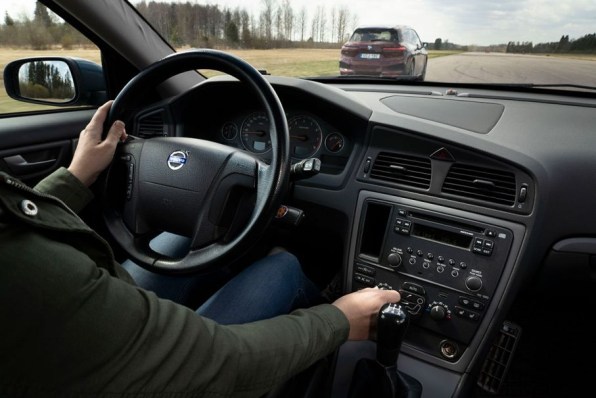
The magazine’s study compared 11 modern cars with touchscreens — from BMW to Mercedes to Nissan and, of course, Tesla — to a 17-year-old Volvo V70 that only has physical controls.
After a period long enough to learn and become comfortable with each car’s user experience, test drivers had to complete a series of four actions while driving at 68 miles per hour. The first was to activate the heated seat and start the defroster (hey, this is Sweden). Then they had to turn on the radio and tune it to the Swedish station Program 1.
They then had to reset the on-board computer and then “reduce the instrument lighting to the lowest level and turn off the center display.”
The results are clearly in favor of buttons and knobs
The magazine then measured the time and distance it took people to complete all of these tasks in a row. The results, they point out, were overwhelmingly in favor of the old Volvo: “The easiest car to understand and operate, by a wide margin, is the 2005 Volvo V70. All four tasks are accomplished within 10 seconds.”
That someone was able to complete all of these tasks in “10 seconds straight” is pretty impressive in itself if you ask me.
Notably, expensive cars with fancy touchscreens loaded with features scored the worst. From the Tesla Model 3’s 23.5 seconds to the MG Marvel R’s abysmal 44.9 seconds, these cars didn’t do a bad job of keeping the user experience clean and efficient. The BMW iX (30.4 seconds) or the Mercedes GLB (20.2 seconds) didn’t fare much better.
Paradoxically, the touchscreen settings found in the cheapest vehicles in testing were actually the most effective. Dacia Sandero (13.5 seconds) and Volvo C40 (13.7 seconds) were almost twice as fast as most competitors. The difference, according to the study’s author, is that these two cars have the right combination of simple touchscreens and physical controls.
Why buttons make more sense than screens
Touch screens are not inherently bad in all contexts. Their user interfaces are great for general-purpose devices that can serve many different functions, such as phones and tablets. These machines become different types of “physical interfaces,” as Jeff Raskin suggests with his idea of ”information device” back in the 80s. Raskin was the human interface expert who led the Macintosh project until Steve Jobs—the only person whose giant ego rivaled Raskin’s—ousted him.
Raskin’s original idea for the “information device” was a single-purpose computing device so easy to use that anyone could pick it up and start playing with it right away, without any training. Like a toaster or microwave oven, this device will have the right number of buttons in the right position and the right software to do its job.
Raskin later realized that his vision was impossible because people could not carry around a perfectly designed information device for every single task. So he fell in love with touch interfaces to create a information conversion device in which each task – GPS, email, music player, drawing pad – can have its own virtual buttons. The first real implementation of this idea was probably the Apple Newton, but it wasn’t until the first iPhone and its applications that it really took the world by storm.
You will notice a clear parallel between Ruskin’s evolution and what happened to cars. For the longest time, cars were the “specialty appliances” that anyone could understand intuitively, with the right buttons in the right places. Some tasks were easier than others, but you could learn them in a short time. And once you do that, you can almost blindingly control all of its functions using pure muscle memory.
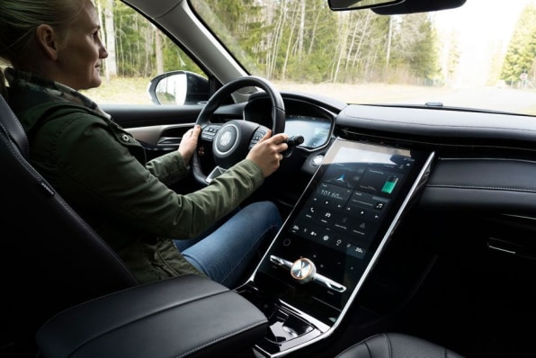
At some point, cars started to get much more sophisticated, introducing features like GPS screens that also displayed the radio station. It made logical sense to introduce touchscreens to consolidate these new features, but the results were layers of increasingly complex interfaces.
It used to be just a turn of a dial to set your seat temperature. In a modern car, you have to navigate through menus to get to the right screen to find the right virtual set of buttons.
It got even worse when Tesla introduced the first giant iPad-like screen in 2012 in its Model X. This allowed Tesla to provide extensive functionality, according to Elon Muskand future expansion of functionality through software updates. It also likely saved the company money by reducing production challenges, one of Tesla’s biggest problems.
Other manufacturers followed suit, further boosted by the success of smartphones among consumers and tormented by the fact that touchscreens are cheaper to be built into the dashboard than buttons and knobs.
Not news to anyone paying attention
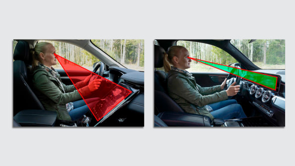
Even if screens look shinier to consumers or cheaper to manufacturers than physical buttons, they come at a different cost. The time it takes to complete tasks in a car is not only an inconvenience, but, as Amber Case, a design expert, research fellow at the Mozilla Foundation, and author of Calm technology—points outit can be distracting and dangerous.
“Because buttons aren’t fixed in specific locations, screens inhibit muscle memory and discoverability,” Case says. “Touchscreens compete for attention with the driving process, adding to the dangers of distracted driving.”
Case’s reasoning is something that car enthusiasts completely understand and agree. The US Navy does too. He published a 2019 study showing that touch screen controls are problematic when performing critical tasks such as driving.
The Navy made this discovery after introducing more and more touchscreens to its ships, concluding that the more things you cram into a touchable interface, the more confusing it becomes.
Again, this is a logical conclusion that has been echoed by car testers in publications including A car, Jalopnik, and Road and track. Why car manufacturers still insist on moving everything to the screen despite the mounting evidence is beyond me.